
Compatibility
Minecraft: Java Edition
Platforms


Details


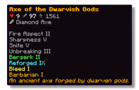
This plugin lets players show off whatever they’re holding right in chat! Just type a simple placeholder in your message, and your item pops up for everyone to see. Others can hover over it to check out its name, enchantments, and all the details just like in your inventory.
Features
- ✅ Show off main hand, off-hand and armor
- ✅ Use a simple command or placeholders in chat
- ✅ Quickly see what item a player is showing off with icons in the chat
- ✅ See all details of an item when hovering above the name in chat
- ✅ Fully configurable
Permissions
- wyg.use - Allows usage of WYG commands
- wyg.hand - Allows showing items in main hand
- wyg.offhand - Allows showing items in offhand
- wyg.helmet - Allows showing helmet
- wyg.chestplate - Allows showing chestplate
- wyg.leggings - Allows showing leggings
- wyg.boots - Allows showing boots
- wyg.equipment.others - Allows showing other players' equipment
- wyg.reload - Allows reloading the WYG configuration (default: op)
Configuration
You can find the configuration files in the plugins/WYG folder. The main configuration file is config.yml.
config.yml
# ═══════════════════════════════════════════════════════════════════════════════
#
#                 █████   ███   █████ █████ █████   █████████
#                 ▒▒███  ▒██  ▒▒███ ▒▒███ ▒▒███   ███▒▒▒▒▒███
#                 ▒███   ▒███   ▒███  ▒▒███ ███   ███     ▒▒▒
#                 ▒███   ▒███   ▒███   ▒▒█████   ▒███
#                 ▒▒███  █████  ███     ▒▒███    ▒███    █████
#                  ▒▒▒█████▒█████▒       ▒███    ▒▒███  ▒▒███
#                    ▒▒███ ▒▒███         █████    ▒▒█████████
#                     ▒▒▒   ▒▒▒         ▒▒▒▒▒      ▒▒▒▒▒▒▒▒▒
#
# ═══════════════════════════════════════════════════════════════════════════════
#
#   WYG - What'd Ya Got!
#   The first item display plugin featuring 1.21+ sprites
#
#   • Advanced placeholders
#   • Fully translatable
#   • Advanced formatting with MiniMessage
#

#  Documentation:
#   • All Placeholders: https://docs.zetaplugins.com/wyg/config/config
#   • Formatting: https://docs.advntr.dev/minimessage/format.html
#   • Sprites: https://mcasset.cloud/1.21.10/assets/minecraft/textures
#
# ═══════════════════════════════════════════════════════════════════════════════


# ═══════════════════════════════════════════════════════════════════════════════
# Share Message Settings
# ═══════════════════════════════════════════════════════════════════════════════
# Configure the message displayed when running /wyg
#
# Relevant Placeholders:
#   <player>      - The player's name
#   <player_head> - The player's head sprite
#   <item>        - The formatted item (uses item-display config below)
#
# Examples:
#   "<player> shared <item>"
#   "<player_head> <player> <gray>shared</gray> <item>"
#   "<player_head> <gray>shared</gray> <item>"
#   "<gradient:yellow:gold><player_head> <player></gradient> <gray>→</gray> <item>"

share-message:
  format: "<player_head> <player> <gray>shared</gray> <item>"


# ═══════════════════════════════════════════════════════════════════════════════
# Item Display Settings
# ═══════════════════════════════════════════════════════════════════════════════
# Configure how items are displayed in chat
#
# Available Placeholders:
#   <sprite> - The item sprite/icon
#   <item>   - The item name
#
# You can also use custom sprites here:
#   <sprite:gui/hud/heart/full> - A heart icon
#   <sprite:gui/icon/checkmark> - A checkmark icon
#
# Examples:
#   "[<sprite> <item>]"
#   "<aqua><u>[<sprite> <item>]</u></aqua>"
#   "<sprite> <bold><item></bold>"
#   "<gradient:green:blue><sprite> <item></gradient>"
#   "<sprite:gui/hud/heart/full> <sprite> <item>"

item-display:
  format: "<sprite> <item>"


# ═══════════════════════════════════════════════════════════════════════════════
# Hover Tooltip Configuration
# ═══════════════════════════════════════════════════════════════════════════════
# You are entering advanced territory! Everything here is already setup to
# replicate Minecraft's default tooltips!

hover-text:
  enabled: true

  # ─────────────────────────────────────────────────────────────────────────────
  # Tooltip Layout
  # ─────────────────────────────────────────────────────────────────────────────
  # Define the order and formatting of tooltip elements
  #
  # Available Placeholders:
  #   <name>              - Item name (single line)
  #   <stack>             - Stack size (skipped if amount is 1)
  #   <enchantments>      - All enchantments (multi-line, skipped if none)
  #   <lore>              - All lore lines (multi-line, skipped if none)
  #   <attributes>        - All attributes with slot headers (multi-line, skipped if none)
  #   <attributes:attack_damage> - Attack damage across all slots (skipped if none)
  #   <attributes:attack_speed> - Attack speed across all slots (skipped if none)
  #   <attributes:armor> - Armor across all slots (skipped if none)
  #   <attributes:armor_toughness> - Armor toughness across all slots (skipped if none)
  #   <attributes:knockback_resistance> - Knockback resistance across all slots (skipped if none)
  #   <durability>        - Durability display (skipped if item has no durability)
  #   <item_name>         - Base material name (skipped based on render-if-same-as-name setting)
  #
  # Custom Sprites:
  #   You can use <sprite:atlas/path> anywhere in the layout!
  #   Examples:
  #     "<sprite:gui/hud/heart/full> <name>"
  #     "<sprite:gui/icon/checkmark> <gray>Enchanted!</gray>"
  #
  # Notes:
  #   • Empty lines ("") create spacing between sections
  #   • Empty lines are automatically skipped if no content surrounds them
  #   • Any placeholder can be wrapped in MiniMessage formatting
  #
  # Examples:
  #   "<gray><enchantments></gray>"
  #   "<gradient:red:blue><name></gradient>"
  #   "<sprite:gui/hud/heart/full> <name>"

  layout:
    - "<name>"
    - "<enchantments>"
    - "<lore>"
    - ""
    - "<attributes>"
    - ""
    - "<stack>"

  # ─────────────────────────────────────────────────────────────────────────────
  # Item Name Configuration
  # ─────────────────────────────────────────────────────────────────────────────
  # Configure how the base item name (material name) is displayed
  #
  # Available Placeholders:
  #   <item_name> - The material's translatable name
  #
  # Note: This is different from <name> which shows the item's custom display name
  #
  # render-if-same-as-name: Whether to show <item_name> when it's identical to <name>
  #                         (i.e., when the item hasn't been renamed)

  item-name:
    format: "<item_name>"
    render-if-same-as-name: false

  # ─────────────────────────────────────────────────────────────────────────────
  # Enchantment Format
  # ─────────────────────────────────────────────────────────────────────────────
  # Format for individual enchantment lines
  #
  # Available Placeholders:
  #   <enchantment> - The enchantment name (translatable)
  #   <level>       - The enchantment level (translatable)
  #
  # You can add sprite icons here too:
  #   "<sprite:gui/icon/checkmark> <gray><enchantment> <level></gray>"

  enchantment-format: "<gray><enchantment><level></gray>"

  # ─────────────────────────────────────────────────────────────────────────────
  # Stack Size Format
  # ─────────────────────────────────────────────────────────────────────────────
  # Format for stack size display
  #
  # Available Placeholders:
  #   <amount> - The stack amount

  stack-format: "<gray>Stack Size: <amount></gray>"

  # ─────────────────────────────────────────────────────────────────────────────
  # Durability Format
  # ─────────────────────────────────────────────────────────────────────────────
  # Format for durability display
  #
  # Available Placeholders:
  #   <current> - Current durability (max - damage)
  #   <max>     - Maximum durability

  durability-format: "<gray>Durability: <current>/<max></gray>"

  # ─────────────────────────────────────────────────────────────────────────────
  # Attribute Display Settings
  # ─────────────────────────────────────────────────────────────────────────────
  # Configure how item attributes are displayed in tooltips

  attributes:
    # Slot Header Format
    # Format for slot headers (e.g., "When in Main Hand:")
    #
    # Available Placeholders:
    #   <slot> - The slot name
    #
    # Note: Set to empty string ("") to hide slot headers entirely

    slot-header-format: "<gray><slot></gray>"

    # Individual Attribute Formats
    # Configure display for each attribute type
    #
    # Available Placeholders:
    #   <value>     - The numeric value
    #   <attribute> - The attribute name
    #
    # You can add custom sprites to attributes:
    #   "<sprite:gui/hud/heart/full> <dark_green> <value> <attribute></dark_green>"
    #
    # Note: Default colors match vanilla Minecraft
    #   • dark_green - Offensive stats (damage, attack speed)
    #   • blue       - Defensive stats (armor, toughness, knockback resistance)

    formats:
      attack_damage: "<dark_green> <value> <attribute></dark_green>"
      attack_speed: "<dark_green> <value> <attribute></dark_green>"
      armor: "<blue>+<value> <attribute></blue>"
      armor_toughness: "<blue>+<value> <attribute></blue>"
      knockback_resistance: "<blue>+<value>% <attribute></blue>"
Support
If you need help with the setup of the plugin, or found a bug, you can join our discord here.
